Color has a significant impact on our lives. Everywhere we
look, there is a rainbow of color, each hue specifically chosen by someone to
evoke a feeling or represent a specific idea. Each of us has reasons that we’re
drawn to one color over another, just as companies have reasons for using one
color over another in their branding or advertising.
There are many agencies who annually deliberate on and come
out with a Color of the Year. These agencies are usually invested in the world
of fashion or interiors, but the scope that their predictions touch reaches far
beyond home décor and wardrobe choices. The colors that are so carefully chosen
for the upcoming year can be seen on everything from cars to appliances to
small household items.
One of the most well-known color predictions is that of
Pantone. Pantone became what we know it to be today in 1962, when it began
producing fan decks of printed color swatches. Since 2000, The Pantone Color
Institute has hosted a meeting of color experts from all over the world. The
meeting takes place over two days, during which numerous presentations are
given on the influences that the experts believe will shape the color trends
for the coming year. After much deliberation, the attendees of the meeting come
to an agreement on the hue that shall be named next season’s Color of the Year.
This year, Pantone’s Color of the Year is 19-4052 Classic Blue. A “timeless and enduring blue hue,” this shade brings a sense of familiarity
and calm and allows us to seek comfort in its depths. The reliability of a tried-and-true
color like Classic Blue is something that consumers are desperately seeking in
the current times of unrest.
 |
| Pantone 19-4052 Classic Blue |
Many paint companies also choose one of their own hues to be
their Color of the Year. Industry leader Benjamin Moore spends several months
performing research and observing trends in design, fashion, and art through
domestic and international travel.
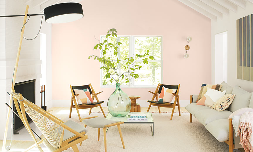
The Benjamin Moore Color of the Year for 2020 is First Light
2102-70. This uplifting blush hue evokes feelings of comfort and happiness,
pointing to the hope of a bright and bountiful future. The optimistic shade is
soft enough to be used as a neutral, making it the perfect backdrop for a
variety of accent colors.
 |
| Benjamin Moore First Light 2102-70 |
Though the colors chosen as 2020 Color of the Year by each
of these companies are vastly different (yet stunningly complimentary), they
are both rooted in the same feelings and virtues. The research performed by
both companies demonstrates current feelings of uncertainty and turbulence in
the world, and a desire for humans to return to an emotional place of comfort
and familiarity.
By: Becka Coolong
Comments
Post a Comment